
Watercolour
Session 2 – Still Life in Jersey.
Introduction to – Still Life in Jersey
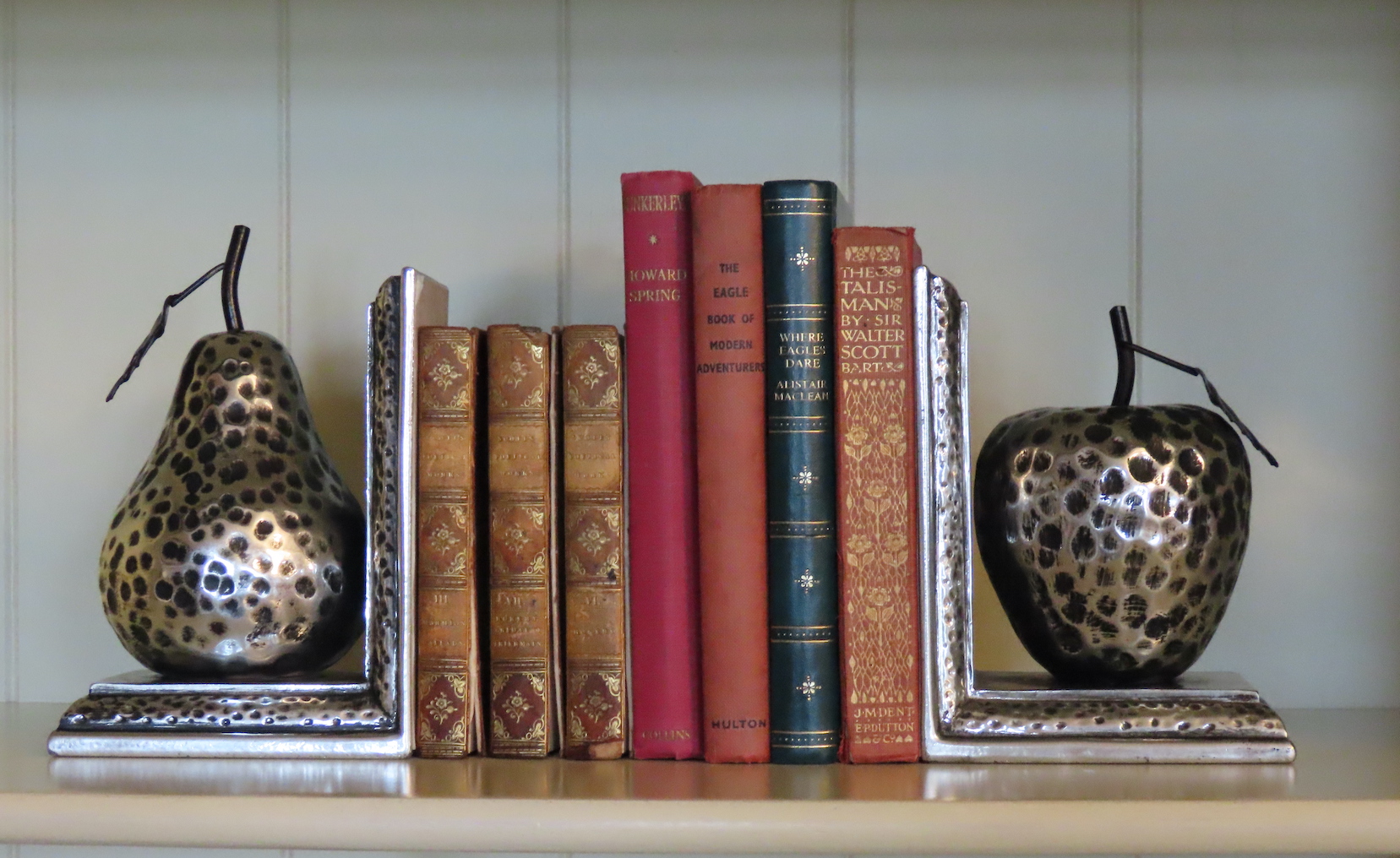
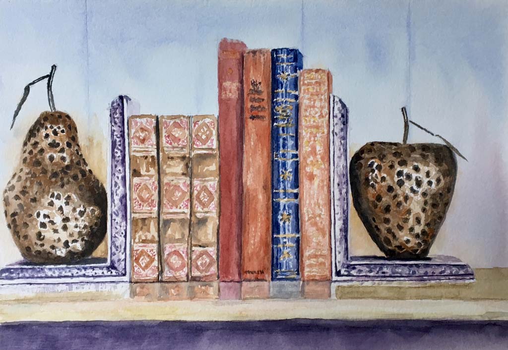
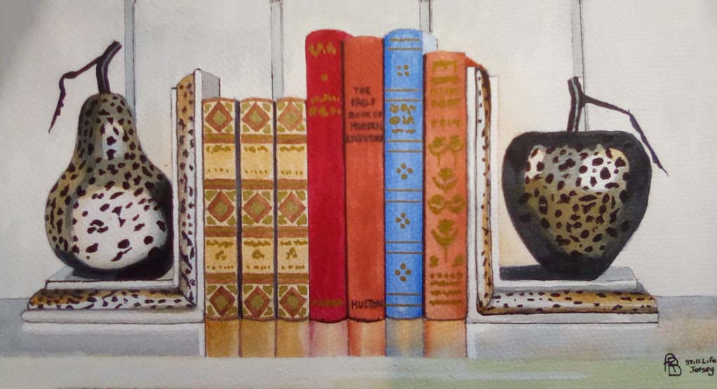
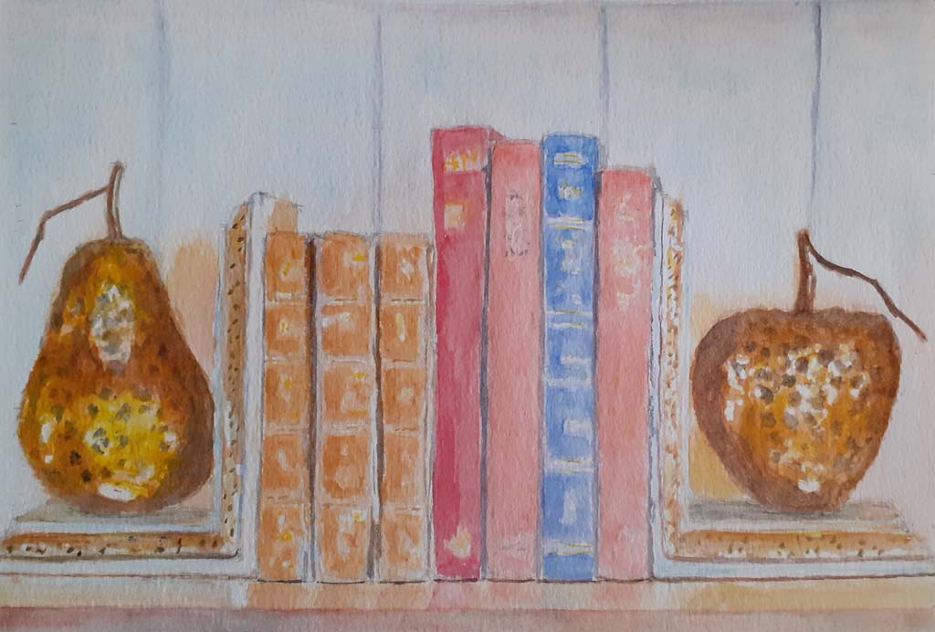
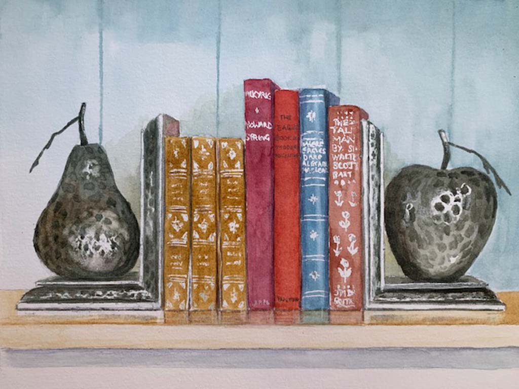
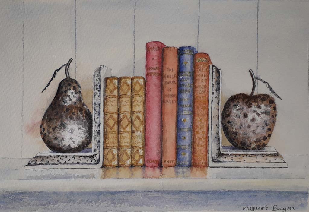
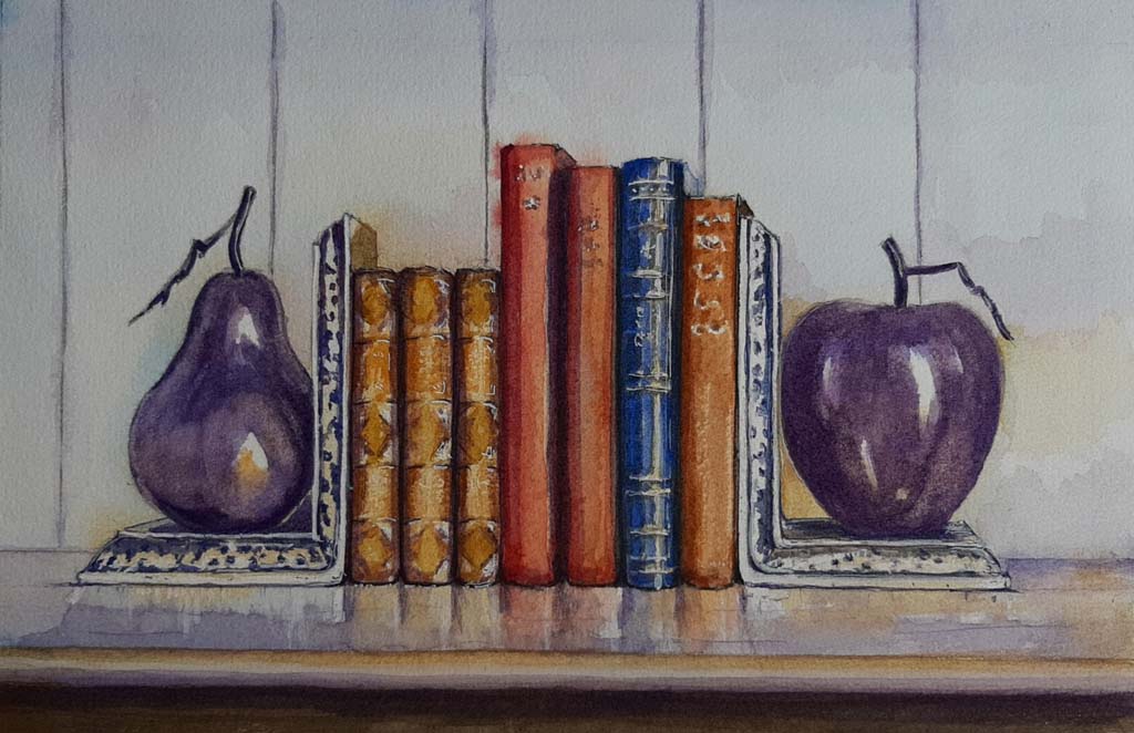
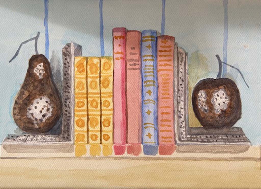
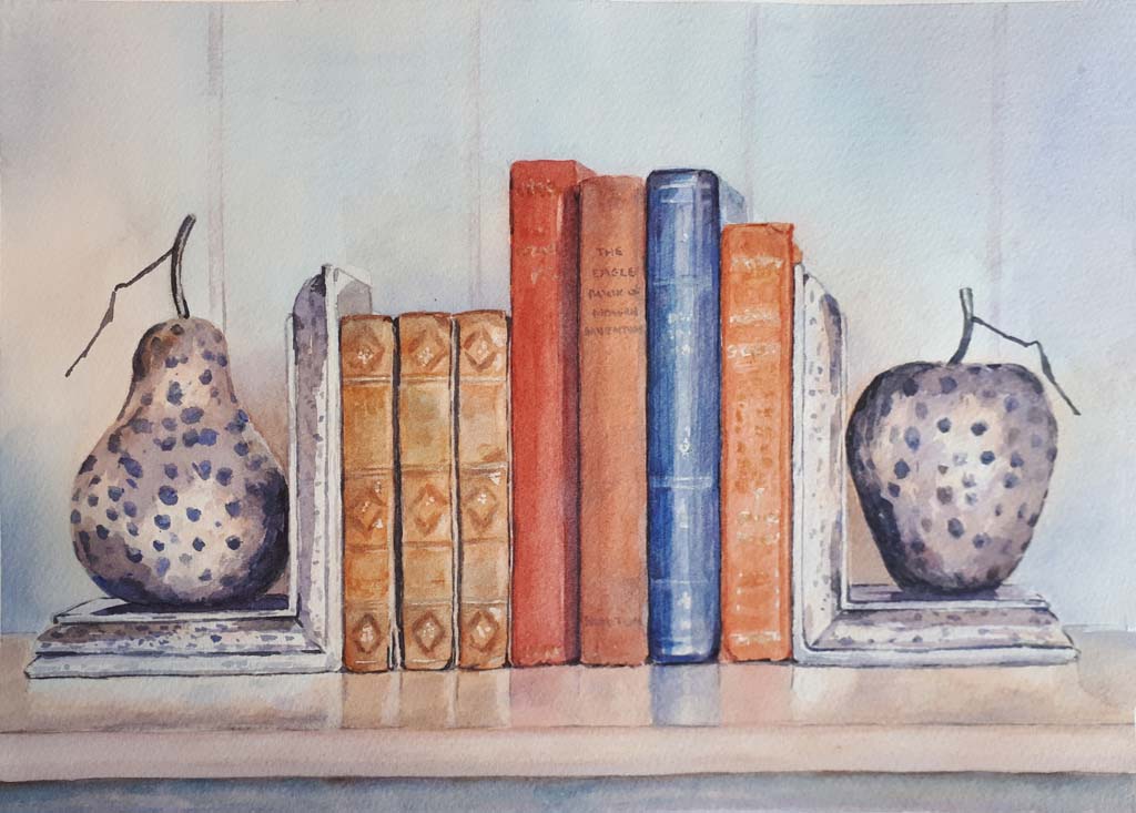
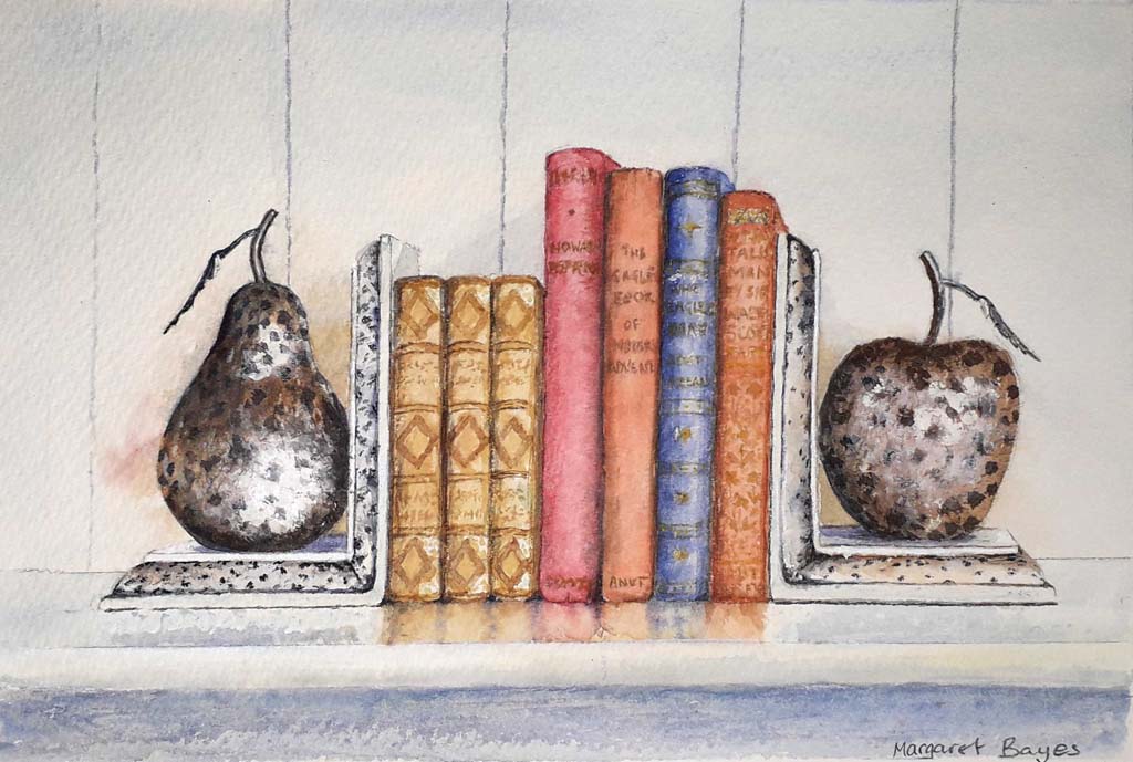
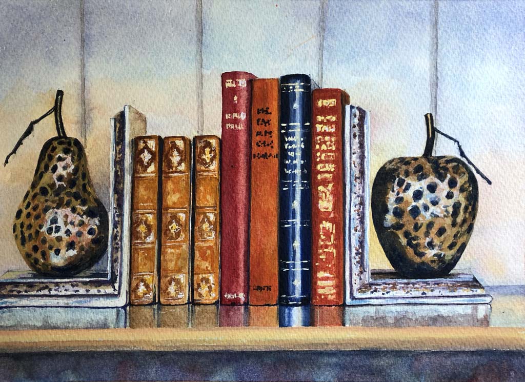
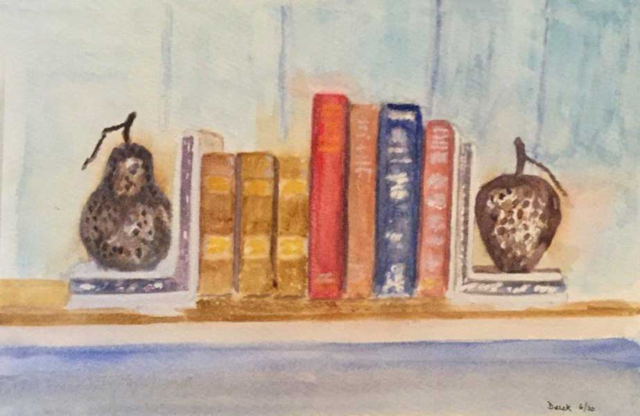
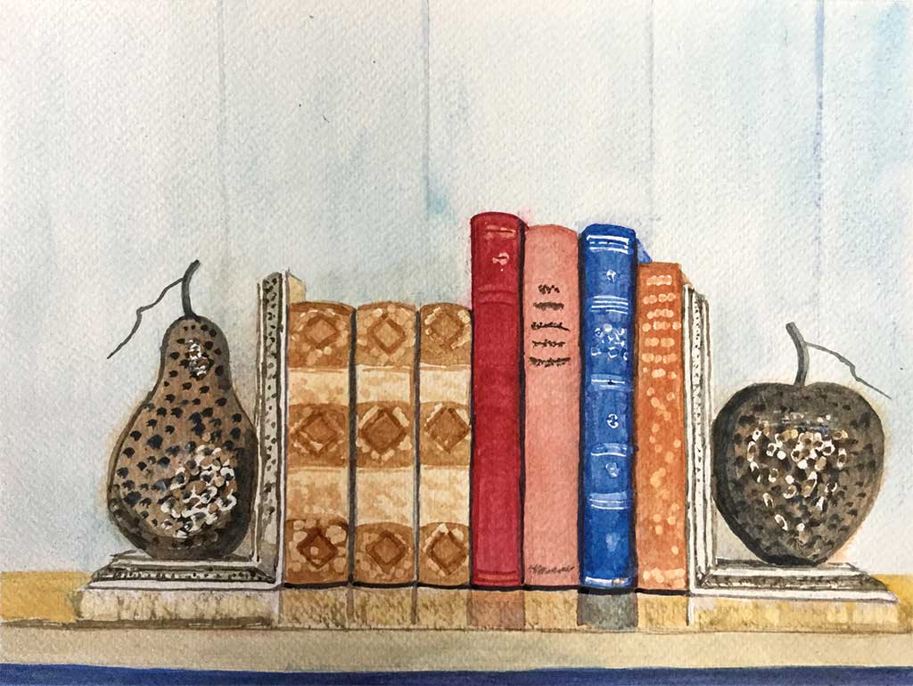
For our second project the subject is a shelf, two fruit like bookends and a selection of books. Be assured – the location remains in Jersey. There is something definite and precise about a still life subject which I feel promotes a more exacting study. This should brung about careful observation. Looking hard at the subject is certain to ameliorate better results.
What does that mean?
- Study of shapes – as mentioned during the intoduction to our first session, careful looking at both the postive shapes (objects) and the negative shapes (spaces in between objects) will assist in a correct drawing whilst ensuring the proportions are accurate. Do take time over the drawing, using a sharp pencil to tease out intricacies that exist within the shapes.
- Consider the colour – careful study will provide a greater perception of the colours within the subject. As your awareness grows, try and make sense of how the colour works and what it will add to the subject. It often helps to put names to colours you can identify.
- Teasing out tone – the existence of light creates the tonal values which in turn creates depth. In our case, the subject is artificially lit by light coming over our shoulder, mainly our right shoulder. Notice how light on one object can reflect on to an adjacent object. See this happening the right side of the pear on the left book end. In this subject we can see colour and light reflecting downwards on the top of the book shelf.
All this is to encourage your study the subject intricately.
Drawing
Treat the book shelf as horizontal, whilst making the books and book ends vertical – a good starting point.
Note we are facing the right bookend, meaning we do not see the edge of this object. Our eye level is also above the line of the bookshelf. meaning we see the top of certain objects – eg. the bookend’s base.
Looking across the shelf to the left we gradually see a little of the side of each object – the further to the left, the more of the side we see. These are just a couple of pointers.
Cropping the composition is an option. Another idea is to place the arrangement ‘off centre’ by allowing a variation either side between the bookend and the edge of the paper.
Preparation and Masking
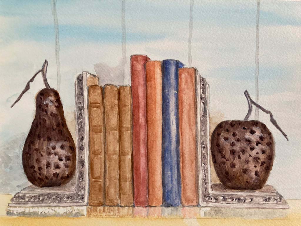
For this exercise, my starting point would be less controlled than the series of washes we began with last time.
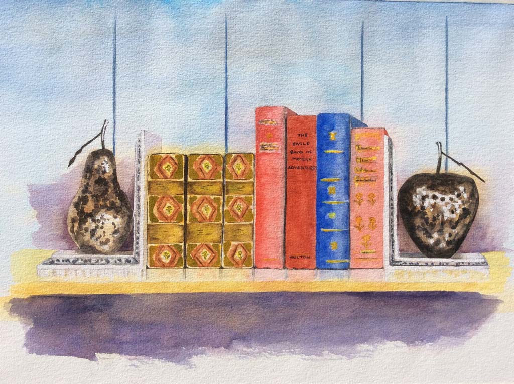
Before we begin, do consider using a masking fluid to define any highlights or in this case a ‘sparkle’, such as in the fruit shaped bookends and light on the spine of the books. Note also the reflections as seen beneath the objects along the bookshelf. The sharpness and purity of white paper against colour can play an influencing role within a painting. There is further information about the process of masking in the short video above.
Masking continued and Palette
First a little more on the masking process.
Now we turn to colour. You do have the opportunity to introduce you own selection of colour.
If you prefer your own colour choice, do consider the colour of the blue book. On the photograph this does stand out strongly. The blue is Ultramarine -ish, which is set against it’s complimentary of orangey / brown creates quite a visual and exciting impact – something to embrace or play down?
Reds – Alizarin Crimson, Burnt Sienna, Cadmium Red. Burnt Umber
Blues – Ultra Blur, Cobalt Blue, Cerulean Blue
Yellows – Raw Sienna, Raw Umber, Cadmium Yellow
White is an option – either a watercolour white, something like Titanium White and or a gouache white, say Permanent White. Traditionally we would tint (lighten) our colour by introducing more water. Here some of the off whites or colour tints are quite opaque, eg. on the bookends – you may require the flexibility given by a white paint to bring about these effects.
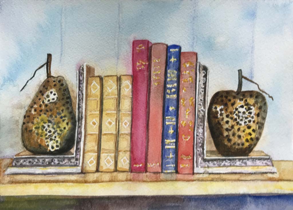
Starting this painting
- The approach is mainly explained in the short video –
Wett the paper, then begin adding colour that will become a useful base on which to build. In certain areas, such as with the background, these may become the finished colour, although generally they will be a starting colour on which to build. For instance there is a lovely sharp blue towards the top of the back panels – here a wash gently applied of Cerulean Blue, might end up as the finished colour.
Throughout this painting process be fairly loose and expressive with the colour added. It should bring about a fresh and spontaneous under colour. The finished effect may lead and influence your approach as you move through the painting. - Colour can be added as long as the added colour remains wet enough to maintain the flow of colour – one into another. Once too dry hard edges will remain – something we want to avoid at this early stage.
- Maintain fresh colour. As mentioned in the video the colours you add can be mixed on the palette, unlike the under washes of the first project. If possible restrict colour mixes to two colours thus helping avoid ‘muddy’ colour which will spoil a freshness we need.
- Allow the wash to thoroughly dry – with your board flat.
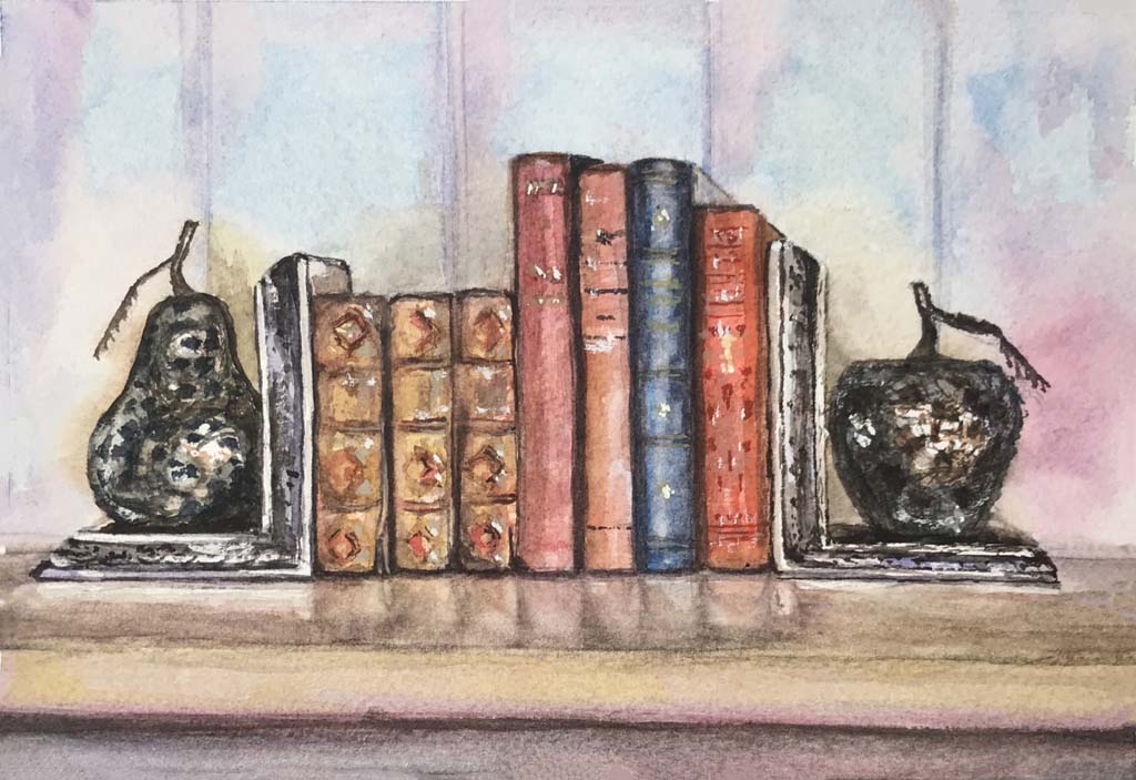
Moving on with the painting
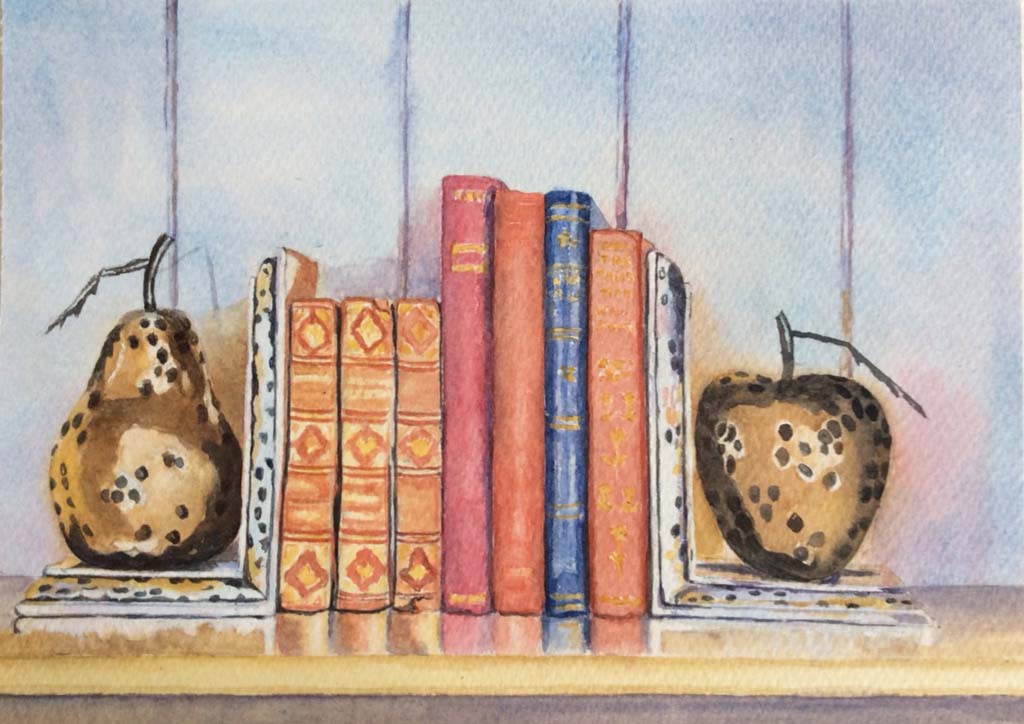
- The masking can be removed – it has now done what is required.
- Over to you to paint and once again add your magical touch.
- As you proceed with the painting, here are one or two tips to consider.
a. First of all consider lifting colour out. There maybe some softening of colour and lifting out to ease unwanted edges – look particularly for unhelpful edges against the masking fluid. You may also want to lift out and soften colour where lighter tones exists – eg on the fruit of the bookends.
b. Begin with the back ground. As with the landscape painting of last time, you are tackling the distance to give a level from which to build. We know with watercolour how influential the edges created by dried areas of colour. All the shapes within the composition obviously stand in front of the back ground. Allowing edges to form as the books etc., are painted will cut off the background – whilst bringing the objects forward.
c. Do look out for the occurrence of reflected light and colour.
d. Consider a hint of object colour appearing within the object shadow.
e. Last time I encouraged you to create depth within areas like the rocks in front of the sea wall. In this respect our subject is no different. Once again dealing with potentially appear as flat objects – such as the fruit on the book ends. We know these are round in shape. The way we use colour and tone need to create the illusion of depth.
I look forward to the opportunity of walking over to your painting and being surprised to find the pear cannot be picked off the book shelf!
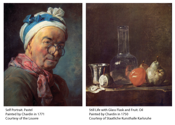
Still Life by Chardin
Jean-Siméon Chardin ( Paris 1699 – Paris 1799)
Chardin painted portraits, interior scenes as well as still life subjects. Although he ended his life in almost obscurity, his legacy had a profound influence on many artists that followed. A series of articles about his work was published in the early 1860’s which re-introduced him and his work to Parisian artists of the day. It is suggested that Manet’s still life work was influenced by Chardin and the way he subtley and effectively used light. Paul Cézanne praised his work in pastel – a medium he turned to later in life. Henri Matisse called him his favourite painter.
His worked on still life is poignant to this exercise, notably because he often arranged his subjects along a shelf or table edge – very similar to our subject. Even with everyday kitchen objects, he beautifully arranged the composition. Using colour he achieved harmony to diverse paraphernalia, whilst allowing the impact of delicate light to emphasise often robust articles. Chardin’s ambition was to paint nature as it was – his success remains for us to enjoy. It is worth a look on line to see examples of his still life paintings. Examples can be found on the National Gallery London and The Louvre websites.
A letter written soon after his death was sent by a friend to the person who was to give the eulogy at Chardin’s funeral service. One paragraph read:-
One day, an artist was making a big show of the method he used to purify and perfect his colours. Monsieur Chardin, impatient with so much idle chatter, said to the artist, “But who told you that one paints with colours?” “With what then?” the astonished artist asked. “One uses colours,” replied Chardin, “but one paints with feeling.”
Conclusion
Hopefully this new way of presenting our watercolour sessions will be more user friendly. I know that one or two have had problems accessing the videos, fingers crossed that this system will make all easier.
There is an email button right end the end of the presentation, so please use this for any queries or indeed feedback, which is always helpful.
Needless to say it would be good if we could all see your work, as before a photo can be sent attached to an email. With the web based presentation your work can be posted on the site once it has been receieved, so it might be worth a look from time to time. No pressure on time – the next project will be introduced in due course. The website will maintian a page for each of our sessions, which will allow you to look back.
Meanhile take care and keep painting – you know it makes sense!
Chas
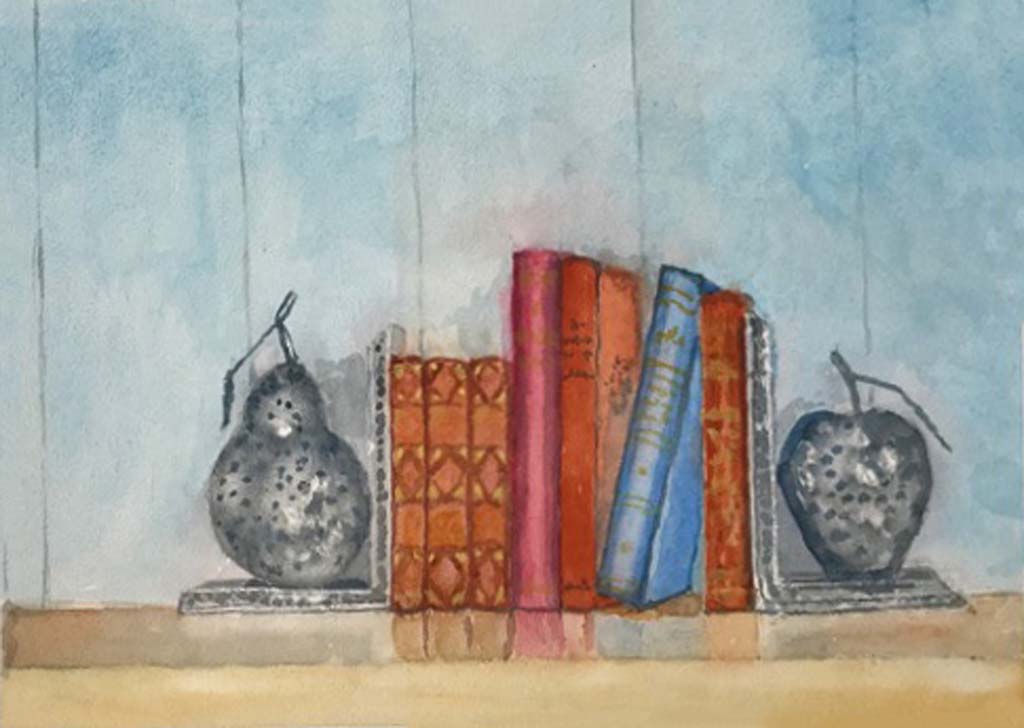
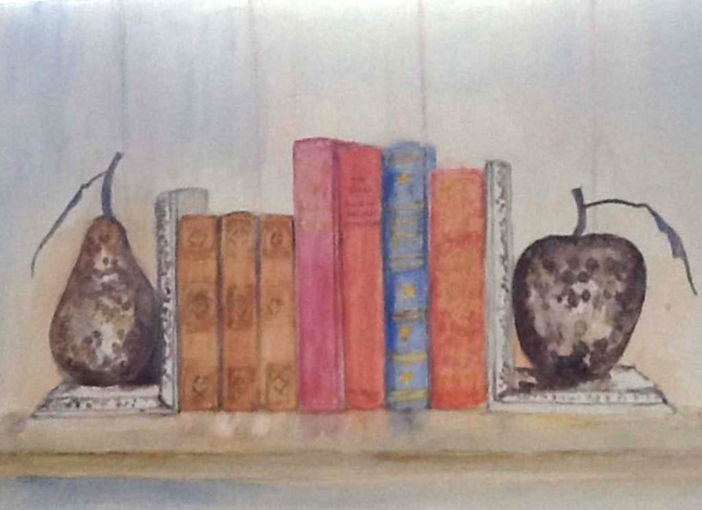
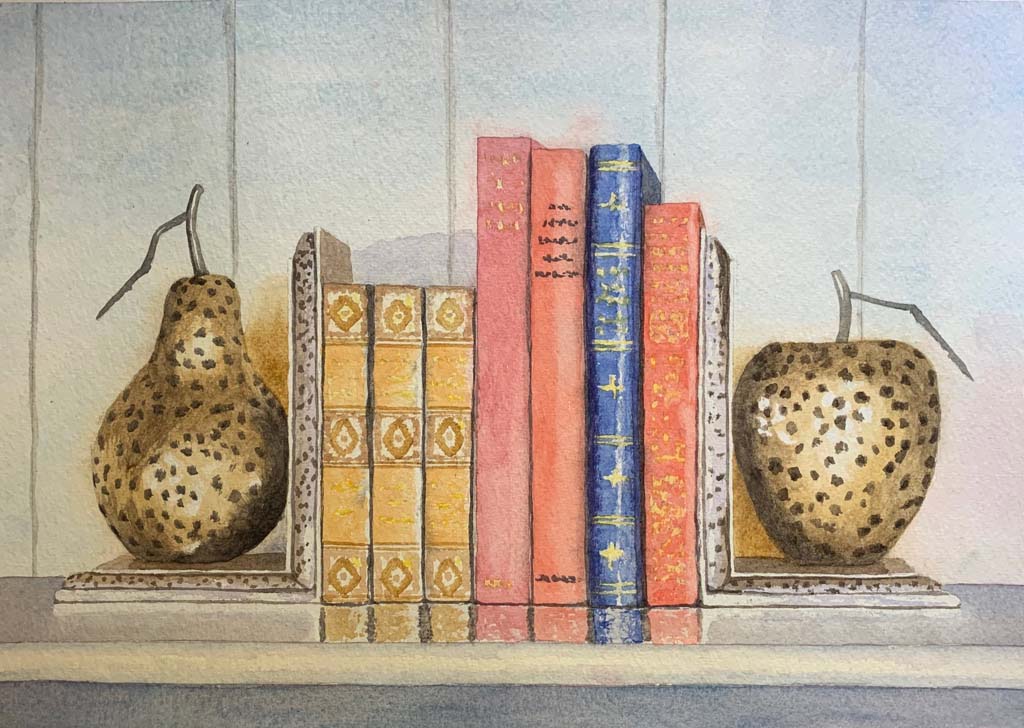
Tracey
Susie
Steve
Roy
Paul
Pam
Margaret
Lini
Kevin

Judy
Judith

Gary
Desmond

Dee
Vicky
Sue C
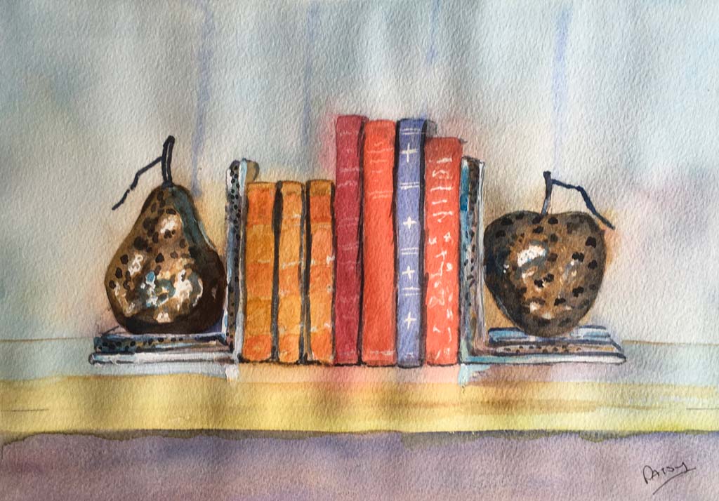
Patsy

Mark
Margaret
Linda
JennyW

JennyW-1
Jane
Chas

Steve-S-
Derek
Brenda
Ask Chas
If you need some advice please do not hesitate to contact me, by filling out the form below: