Watercolour
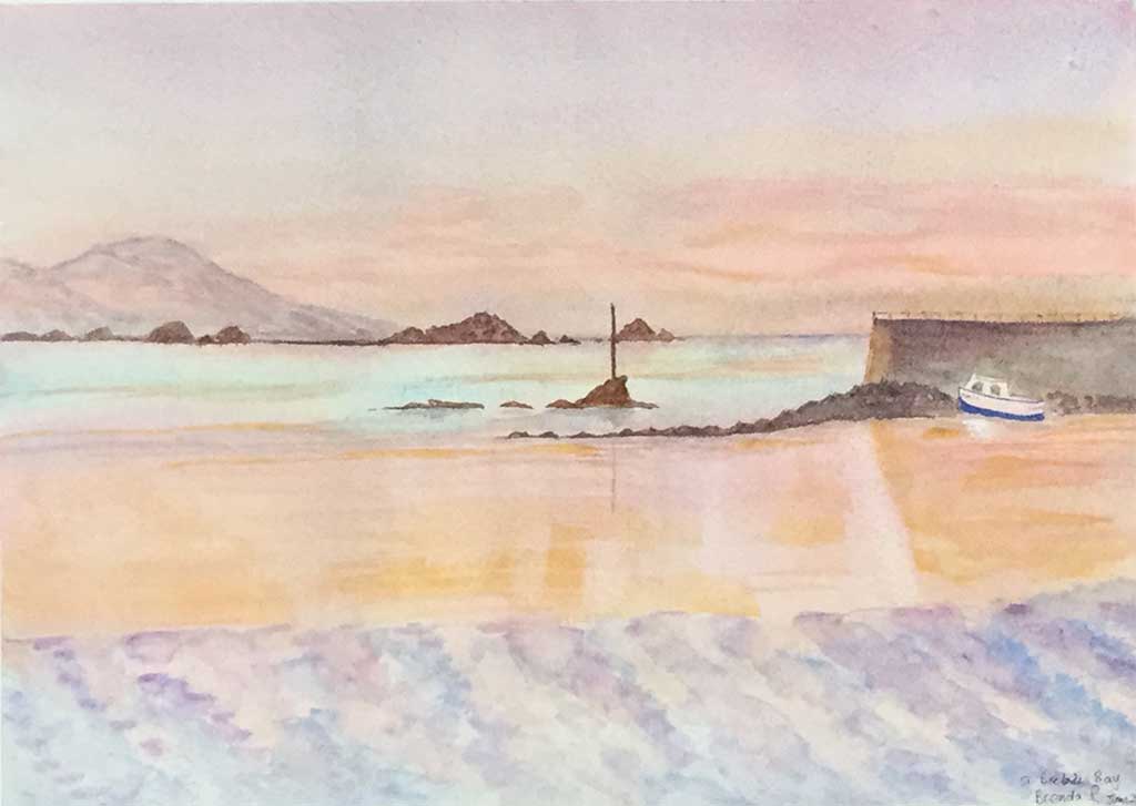
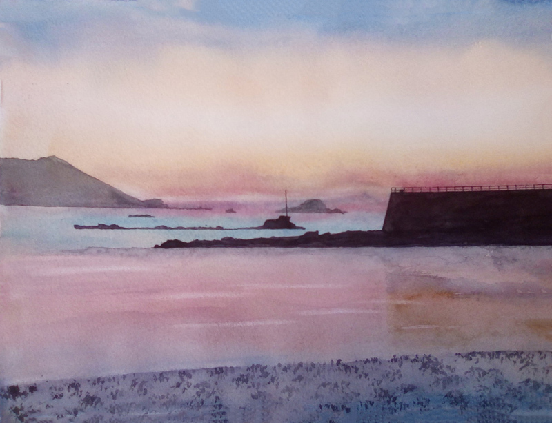
Session 1 – Sunset over St Brelades Bay.
Composition and drawing – Sunset over St Brelades Bay
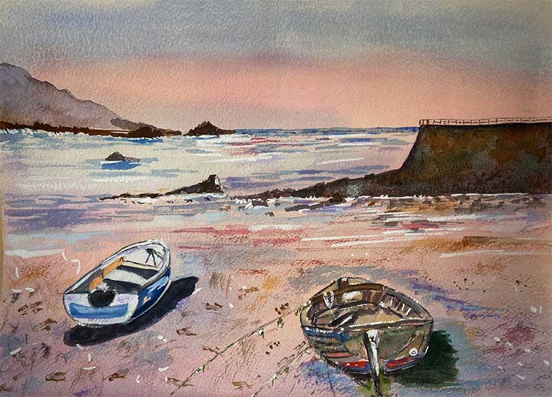
I make no apologies that through our sessions St Brelades Bay will feature more than once in various guises. All sorts of reasons – it is one of my favourite locations on the island, whilst attracting some eye watering skies – so please indulge me. Let’s begin with some points to note.
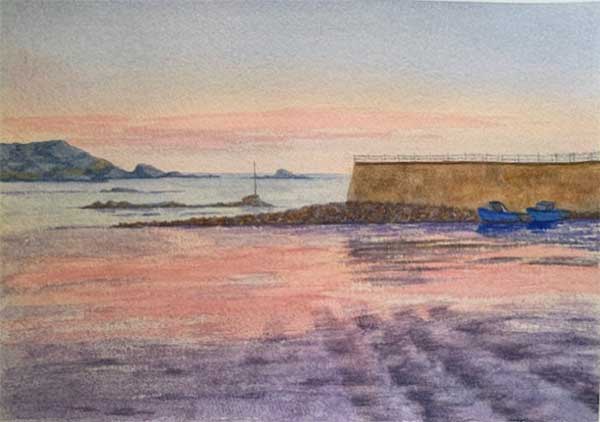
- I am keen to begin with a fairly straight forward subject which is not too challenging as we consider the drawing stage. Before embarking on the drawing do contemplate the composition and whether cropping the image might work for you.For instance some of the foreground could be lost, although I do like those directional lines in the wet sand leading us from right to left towards the sea and into the subject. The boats on the right are optional – but fear not they will return in a later exercise!
- Drawing. It might help to start with a horizontal line across the paper to pitch the location of the horizon line. From here you can plot the seawall, distant landscape, gradually building up your drawing. Do consider the negative shapes. The dark shapes of the seawall, near rocks and distant headland really help with an appreciation of the lighter space (negative) shape in between – the sea.
Maybe you don’t need much outline for the foreground, other than an indication where the aforementioned diagonals might be placed.
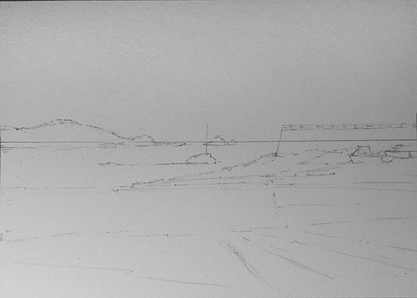
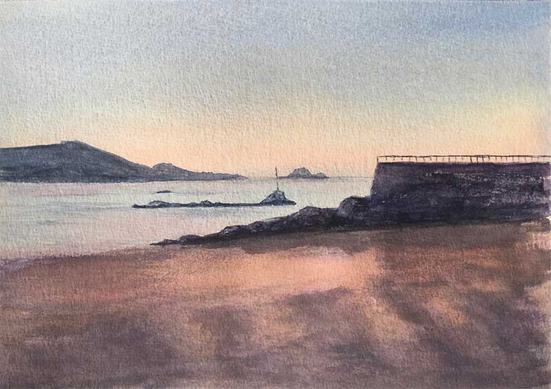
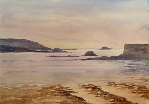
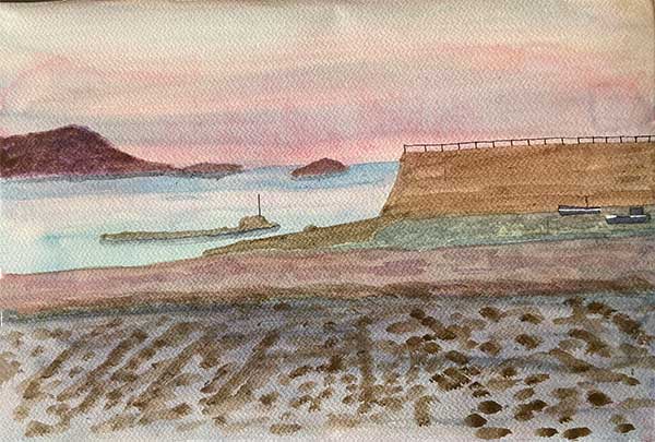
Drawing
Showing the initial horizontal line providing the horizon line.
I have loosely used the third dimensions vertically with the end of the seawall, the dip in the distant headland. Horizontally the shoreline as mybottom third.
Palette and Preparation
I would suggest masking or drawing gum is not required. Palette:- Cerulean Blue, Cobalt Blue, Ultra Blue (to help with the darks) Alizarin Crimson, Burnt Umber, Burnt Sienna. Raw Sienna. Ultramarine Violet could be an additional option or Dioxazine Violetwhich is the Winson and Newton Cotman series equivalent.
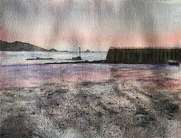
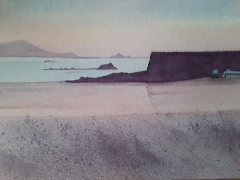
Initial Wash
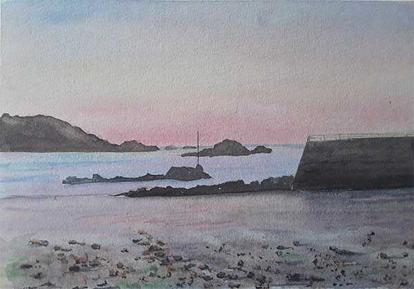
Regulars will not need reminding how important and influential the first layer of colour is in a watercolour painting. In this case we are looking at a ‘wet on wet wash’ of Raw Sienna. This is to be applied as a graded wash, meaning the strength of the colour comes and goes as in this case we work down from top to bottom. The image below gives some ideas of how this can work and where the colour needs weakening or strengthening. Before the wash dries, try lifting a little of the colour out here and there, particularly where there are slightly brighter and stronger of areas of red in the sky – just above the horizon line and above the sea. This will make the paper here more white and therefore when we add the next colour, the crimson, it will be brighter as there is less Sienna to influence. A flat brush would be a good choice to execute this lifting out technique, but make sure the brush is clean and dryish as the colour is lifted out. It may need repeating as colour my seep back.
2nd Wash – Alizarin Crimson
The first wash needs of course to be dry before we begin to add two further washes. The drying which fixes the colour, ideally needs to be left to dry naturally – time to go and do something else for an hour or so.
The second wash is with the Alizarin Crimson, once again applied on a wet surface. Wetting the paper before mixing the colour ensures there is time for the water to settle before applying the colour.
Again the wash is applied over the whole paper and again you may want the colour to come and go to add subtly to a variation – see video.
3rd Wash – Cobalt Blue and Cerulean Blue
Once the wash is thoroughly dry apply a further wet on wet wash using a combination of the two blues, Cobalt and Cerulean blues, over all the paper.
I prefer these to be added as single colours rather than as a mix. Any mixing or blending of the blues can be achieved on the paper as the colours are worked one into one another. Remember the Cerulean is a cooler blue than the Cobalt.
Do make reference to the photo as you paint in order to continue the variation, especially in the sky. Be careful the Cobalt is quite a ‘heavy’ colour and can pull the underneath colour. One reason for the previous colour to have properly dried and fixed.
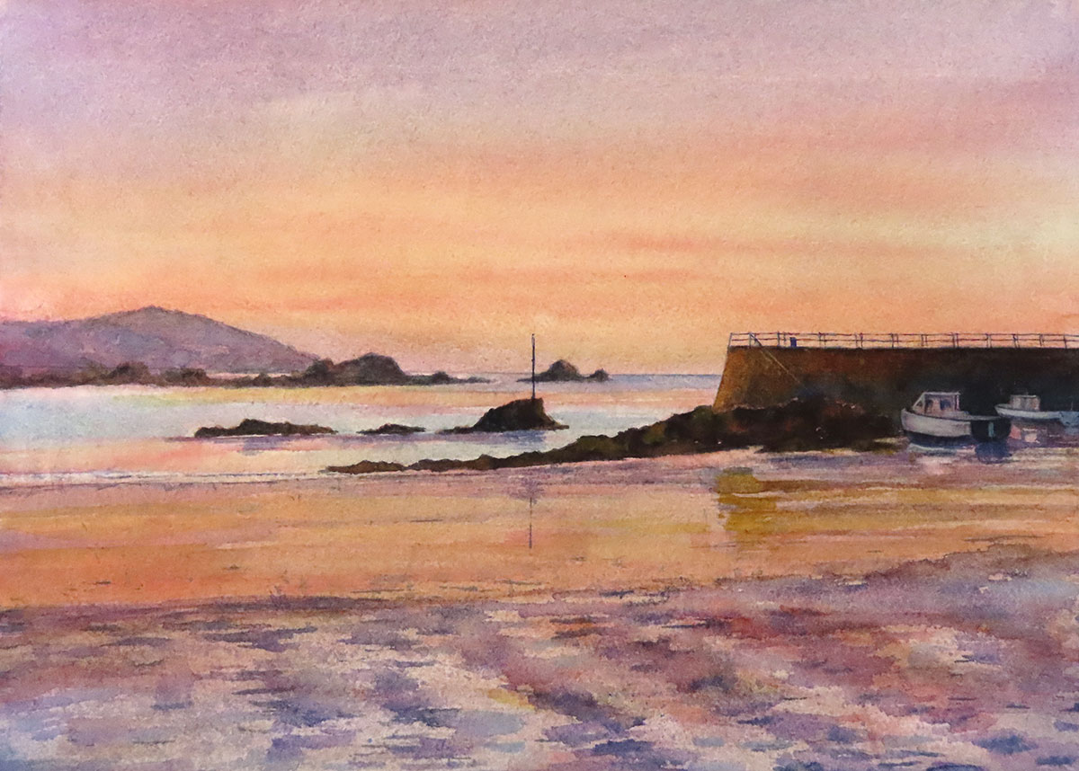
Tips on completing the painting
So that completes the first stages of the painting – now you are on your own.
Here are a few pointers you may want to consider.
1. With the final wash of the two blues complete and dry, I am suggesting the sky is complete – at least for the moment. If there needs to be a debate in your mind about adding more to the sky – only do so once there is a landscape set against it. I think for mine, I would be looking again at strengthening those areas of red in the sky, which I would do wet on dry . . . but gently.
2. The surface you have created with the washes – again I stress, once dry – will provide you with a truly wonderful surface on which to add more paint. BUT first of all contemplate any areas that successfully might be left with the purity they now have. We will no doubt come back to this approach on another occasion.
3. First I would begin with the most distant landscape, that on the left against the horizon. Remember achieving the level of distance required you would use coolish colour, a hint of tonal variation and a weak mix. Needless to say, coming forward, the colour becomes stronger, warmer and contains greater variation colour and tone. Although much of the landscape is in silhouette you may be able to make out a little detail in the near rocks in front of the seawall. Anywhere you see detail try to bring it to notice – this will obviate the appearance of flatness.
4. With the very wet sand, note there is a hint off reflection from the sea wall, which breaks apart across the wet sand.
5 Finally the foreground – techniques such as dry brush would work using the side of round brush with a dryish colour. Splattering with an old tooth brush would also give a useful effect. Be aware in the near ground that aspects of lighter colour can be seen – this might have been achieved already through these first and early washes.
Best of luck.
Conclusion
Below you will see we have created a gallery of your work so we may all enjoy your talent. As and when we receive more work from this session, these will be added too.
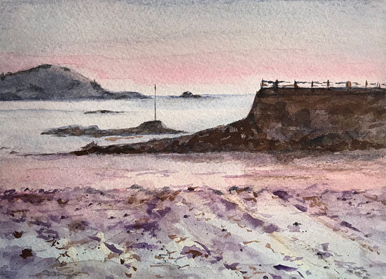
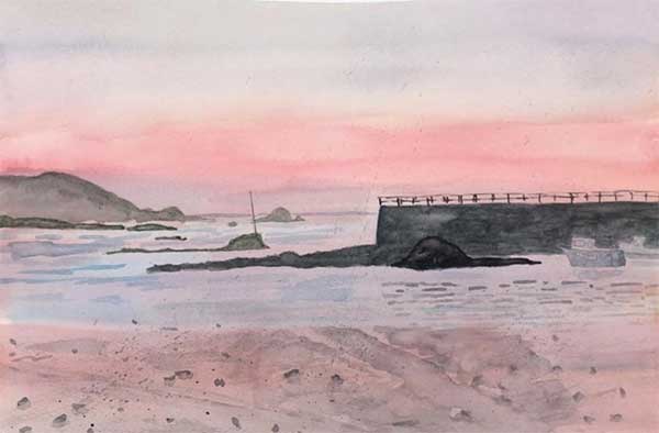
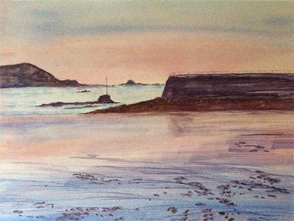
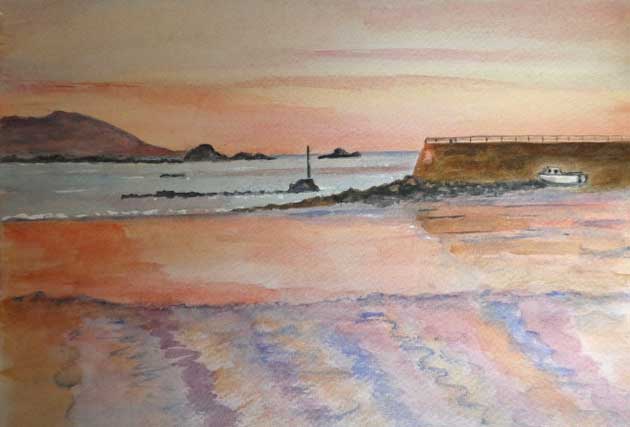
Above is brief look back at my finished piece within which I have suggested one or two points regards my process which might be of interest.
Right at the end of this page, there is an email link, allowing you to raise any points or let me have any feedback.
Take care and keep painting!
Chas
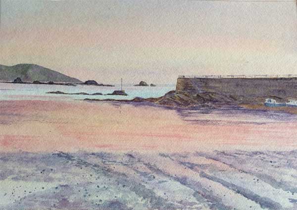
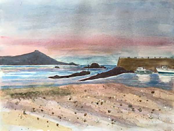
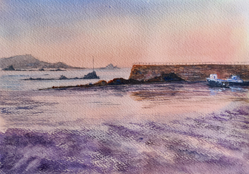
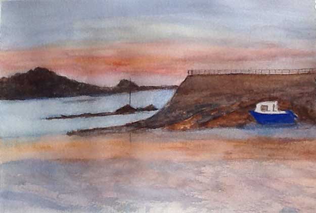
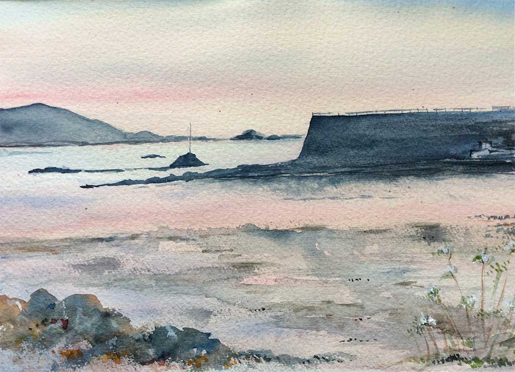
Gallery
Thank you and congratulations to the Watercolour Group. We are pleased to be able to show you their work on this project receievd. Click on an image to see a larger version.
Please use the email link below if you have any queries or require further information.
Tracey
Susie
Sue
Steve
Pauline
Patsy
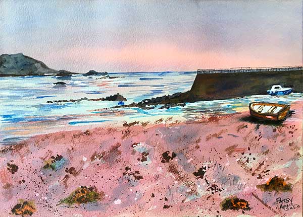
Patsy
Pam
Lini
Kevin

Julie
Judy

Judith

Jean

Desmond

Cathryn
Carole
Mark
Linda

Paul

Mark
Jenny W
Dee
Steve
Roy
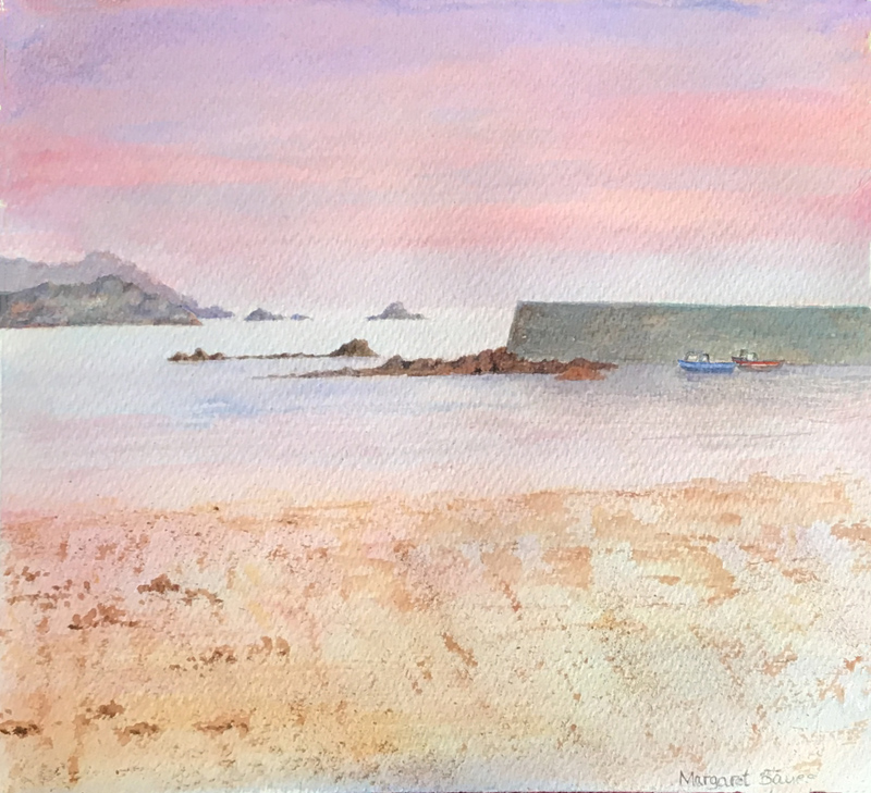
Margaret

Jenny M
Vicky
Trish
Steve.S
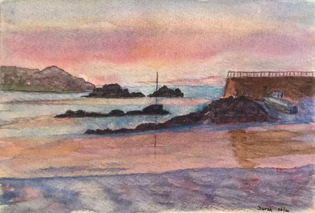
Derek